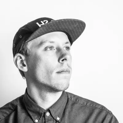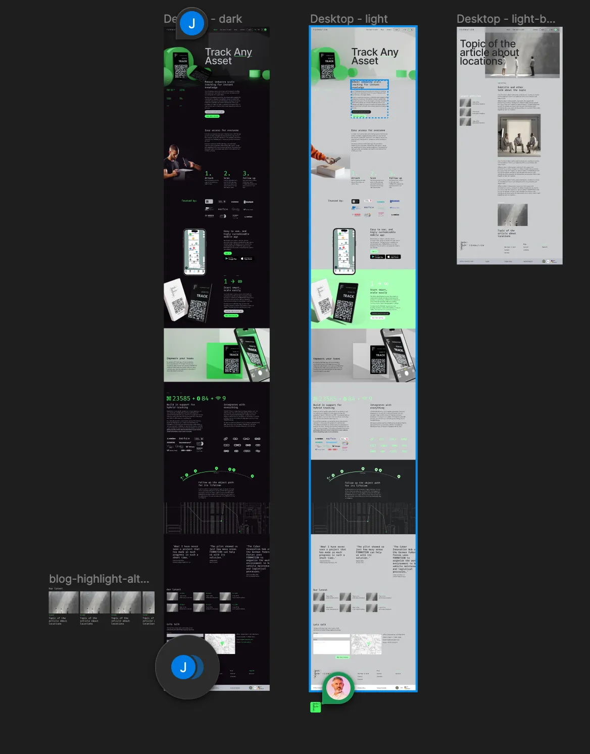
FORMATION has a new website! With the help of H23, a Finnish design agency headed by friend of our company Miiro Seppänen, we’ve completely redesigned the FORMATION website. The new design focuses on delivering our core message: “track any asset”.
The new design has a few nice features, including a dark and light mode design, super fast page loads, lots of subtle transitions and animations. Our goal with this is to more clearly position FORMATION as a SAAS business. With clear calls to action, messaging, and by doubling down on the core values of our product, we will take FORMATION to the next level.
The project started last year when we met Miiro when he visited Berlin. Many video calls followed and we got busy getting our messaging right. This is of course critical for a good design. Lorem ipsum does not inspire designers the same way as the real message.
Special thanks to Miiro and his team as well as Bernard van der Weest who helped with the initial transition of Miiro’s Figma designs to HTML.
How we built our website

This is how we built our website:
- The website was designed in Figma.
- We retired wordpress in favor of a static site generator called Hugo. This is a richly featured software package that helps us build a so-called static website. We used and adapted Hugoplate, which is an opinionated take on various other bits and bobs needed to build a hugo based website. This saved us a lot of time.
- The website is styled using Tailwind CSS, which is something we are also hoping to bring to our product.
- The files of our website are hosted in our Google cloud platform via their CDN (Content Delivery Network). Using a CDN means that the site downloads quickly wherever you are in the world via one of Google’s local data centres.